
Let’s be honest—when you first notice a new brand, what really sticks with you?
For most of us, it’s the logo.
That little symbol or wordmark quietly tells you, “This is who we are.” Sometimes, even before you read a tagline or check the product.
But here’s the catch—not all logos are the same. In fact, there are several major types, and each one creates a distinct vibe for your business. Some shout authority, others feel playful, and a few just scream luxury.
Are you finding the Right Logo for your business?
Then, definitely, you should know the types of Logos.
- Wordmark
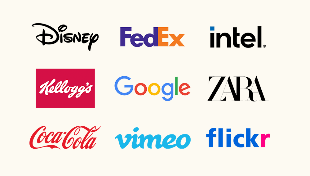
- This is your brand name written in a unique style. Think Google or Coca-Cola.
- Great if your business name is short and catchy.
- Simple, memorable, and all about the name itself.
For More:
A Wordmark Logo focuses only on the name of the brand. No icons, no fancy symbols—just the brand name written in a unique, designed style. They don’t need extra symbols. Their name itself is powerful enough to be the logo. The wordmark lies in its typography.
The choice of font, spacing, and even colour all work together to make the brand name instantly recognizable. It’s the best option for businesses that want their name to stick in people’s minds. Especially if your brand name is short, unique, and easy to pronounce, a wordmark can do wonders.
In simple words: A wordmark logo is your brand name, but dressed up in its best outfit—so it’s remembered wherever it goes.
- Lettermark
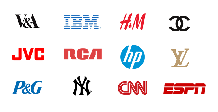
- Instead of the full name, it uses initials—like IBM or CNN.
- Perfect when your brand name is long.
- Clean and professional.
For More:
A Lettermark Logo is a logo that uses the initials or abbreviations of a brand’s name.
Instead of showing the full name, it highlights a few letters in a unique design. For example: IBM, HBO, or CNN. Their full names are long, but their lettermarks make them short, memorable, and super easy to recognize.
The design power lies in typography — the font, style, and arrangement of those letters. A well-crafted lettermark can carry the entire personality of the brand in just two or three characters. It’s perfect for businesses with long or complex names that want a clean, professional, and instantly recognizable identity.
In short: A lettermark logo that takes the initials of your brand and turns them into a bold visual signature.
- Pictorial
- A symbol or icon that represents your brand. The Apple apple, the Twitter bird.
- Easy to recognize, even without words.
- Best if you want a strong visual identity.
For More:
A Pictorial Logo is a logo that uses a symbol or an icon instead of words.
It’s an image that instantly represents the brand — simple, clean, and powerful. For example, the Apple logo, Twitter’s bird, or Nike’s swoosh. Even without a single letter, the audience knows exactly which brand it is.
The magic of a pictorial logo is in its simplicity. A single image can tell a whole story, create spirit, and stick in people’s minds faster than words ever could. It is a Good option for brands that want to be universal — something anyone, anywhere in the world can recognize at a glance.
In short: A pictorial logo is your brand’s face in one picture — clear, memorable, and timeless.
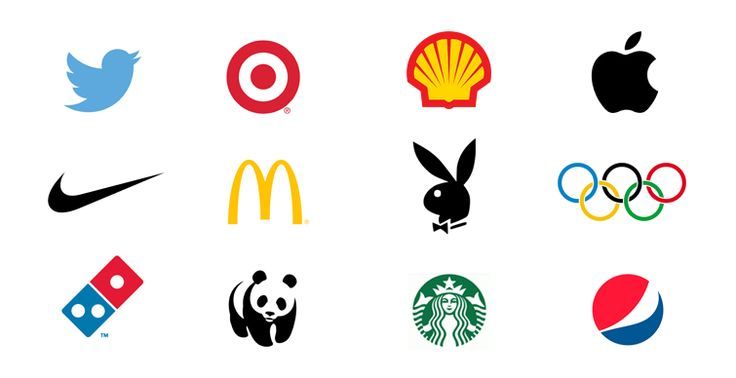
- Abstract
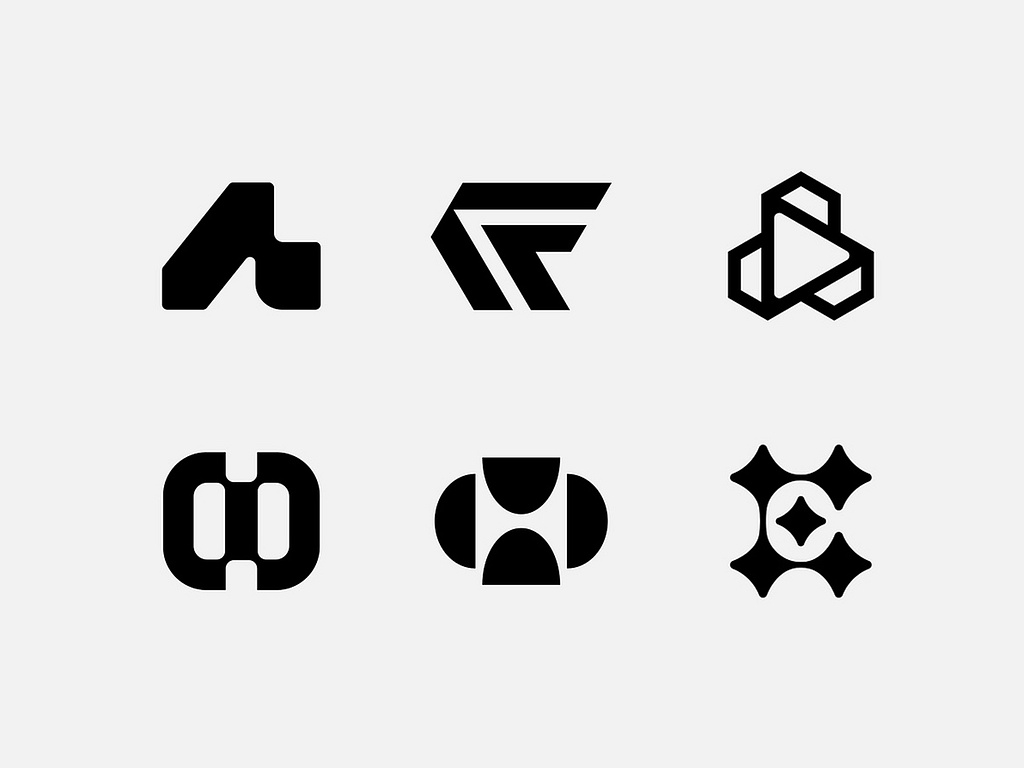
- Not a literal picture, but a unique shape—like Nike’s swoosh.
- Feels modern and versatile.
- Lets you tell a story in a very visual way.
For More :
An abstract logo is basically when a brand doesn’t use a real object in its design. No bird, no mountain, no coffee cup — just shapes, colors, or patterns that stand for an idea. Take Pepsi’s circle or Adidas’s three stripes. At first, they don’t show what the product is. But with time, people connect those shapes with the brand itself.
That’s the trick — it’s not about what the logo shows, it’s about how it makes people feel and what they remember. The good part? You’re free. You don’t have to stick with an image that might limit you later. You can design something unique that grows with your brand.
In short: An abstract logo is just a creative way of saying, “This is us” — without spelling it out.
- Mascot
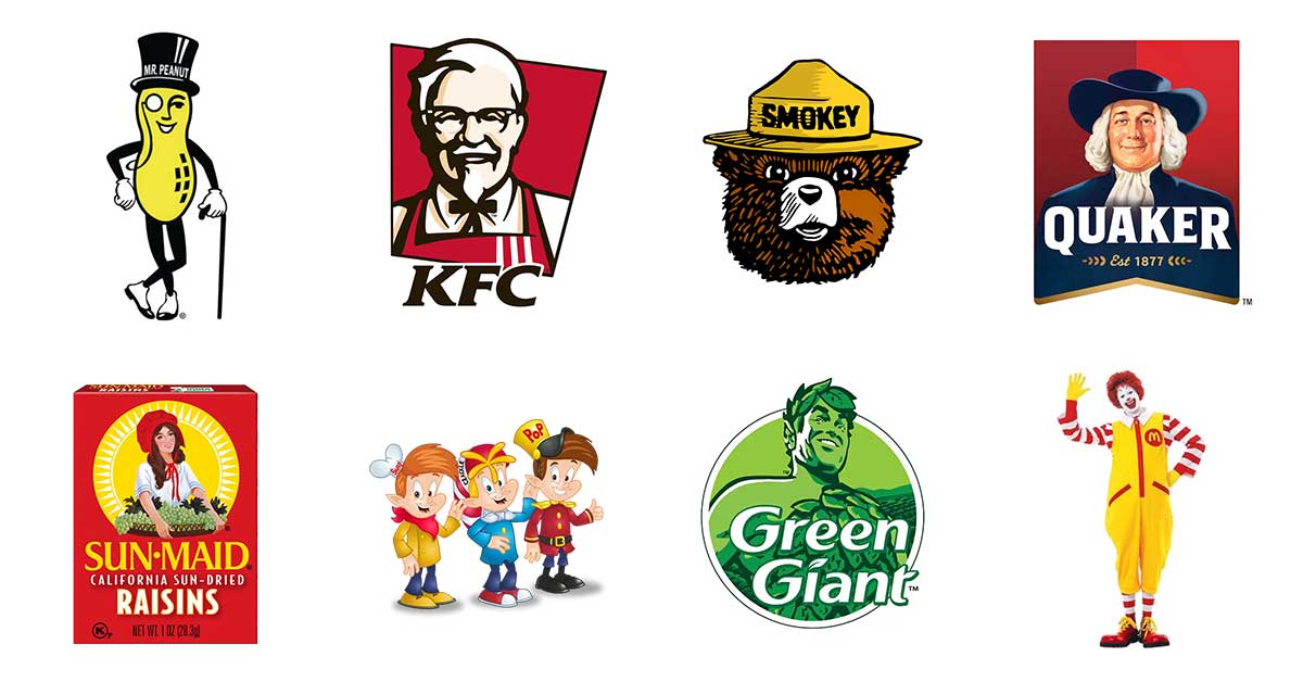
- Think of KFC’s Colonel Sanders or the Pringles man.
- Fun, friendly, and relatable.
- Works well for family-focused brands.
For More:
A mascot logo is when a brand uses a character — usually a person, animal, or even a cartoonish figure — to represent themselves. Think of KFC’s Colonel Sanders, the Michelin Man, or the little tiger on a cereal box.
The mascot basically becomes the “face” of the brand. It’s friendly, easy to remember, and often adds a playful vibe. That’s why sports teams and food brands love mascots — they make people feel more connected, like they’re talking to a character instead of just a brand.
Of course, not every business needs one. A law firm with a dancing cartoon might look silly. But if your brand is family-friendly, playful, or wants to build strong emotional recall, a mascot logo can be a game-changer.
- Combination

- A mix of text + symbol. Like Adidas or Burger King.
- Super versatile.
- Safe option if you’re not sure which direction to take.
For More:
A combination logo is exactly what it sounds like — a mix of a wordmark (your brand name) and a symbol or icon. Think of brands like Adidas, Puma, or Lacoste. You’ll always see their name paired with a strong visual element. This mix makes the design more versatile and powerful.
Here’s why it works: when a brand is new, people might not recognize the symbol alone. But when you show both the name and the icon together, it builds memory faster. Over time, once your audience knows you well, you can even use just the symbol — and people will instantly connect it back to your brand.
The real strength of a combination logo is balance. It gives you clarity through words and impact through visuals. That’s why it’s one of the most popular logo styles in modern branding.
- Emblem

- Logos with text inside a badge, seal, or crest. Example: Starbucks.
- Classic and detailed.
- Gives a sense of heritage or prestige.
For More:
An emblem logo is like the old-school king of logos. It’s the type where the text and design sit inside one solid shape — like a badge, a shield, or a crest. If you think about Starbucks, Harley-Davidson, or even football clubs, that’s the vibe. Strong. Bold. Hard to ignore.
The reason people love emblem logos is that they feel authentic and trustworthy. It’s not just a name floating around; it’s locked into a shape that looks official and carries weight. That’s why schools, government bodies, and luxury brands often go for it — it gives a sense of heritage and authority.
The only downside? If you shrink it too much, the small details can get messy. But when it’s big and clear — on packaging, uniforms, or even store boards — an emblem logo doesn’t just represent your brand. It demands respect.
How do you choose?
Ask yourself:
- Do I want my name to stand out?
- Or do I want a symbol people instantly recognize?
- Does my brand feel more modern, playful, or traditional?
Your answers will tell you which type of logo feels right.
Final thought:A logo is more than just a design. It’s the face of your business.
Pick one that actually speaks for you—because a good logo doesn’t just look nice, it makes people remember
Leave a Reply